I wanted to point out two excellent resources for explaining some of the macroeconomic issues related to the debt ceiling standoff in Washington at the moment.
The first is a dispassionate piece from FactCheck.org that examines U.S. federal spending versus income. The current problem is represented in this graph:

The red is outlays — or spending — and the blue is revenues. Not a pretty picture.
(Interestingly, on the one hand, the gap between spending and revenue is especially big now. But on the other hand, running a significant deficit has been the norm since the 1970s.)
To summarize the piece: For the last several years we have had increased federal spending due to the stimulus package, banking bailout, and Social Security and Medicare payouts. In addition, military costs are up due to post-Sept. 11 wars.
At the same time, federal revenues are down partly due to reduced income tax receipts because of the Bush tax cuts. And the recession has meant less revenue from corporate taxes.
Read the whole thing.
And second, I suggest listening to the most recent episode of NPR’s “Planet Money” podcast. It’s called “How Much Debt Is Too Much?”

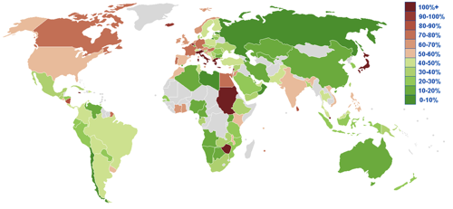
Harvard economist Ken Rogoff discusses historical rates of sovereign debt and examines various countries’ GDP to debt ratios. This is a measure of the total value of nations’ economies compared to how much they owe.
What do you think this ratio is for three countries in the news of late: Greece, Italy, and the U.S.?
Listen to the show to find out. The figures may surprise you.
(Image: Global debt to GDP ratio, via Wikipedia.)


