I am a passionate believer in the importance of Web design usability. Web sites, more than anything else, should be easy to use. Simple. Straightforward. Focused. No bells and whistles.
In my work as a Web strategist for nonprofits, I often argue for Web usability from an aesthetic and functional standpoint: people like the way simple Web sites look, and such sites communicate information more efficiently than cluttered ones. Web sites that are visually initimidating are frustrating to navigate.
But needlessly fancy Web design also has financial implications.
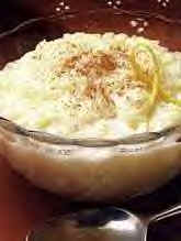
I was talking to my buddy Benny C. last night, and the subject of a gourmet rice pudding restaurant in New York City (yes, you read that right) came up. Our pal David Z. visited the place and sent their link around to us the other day and raved about it.
So Benny, being a foodie, went to the restaurant’s site and tried to place an order for some $50 worth of rice pudding. Note that I said tried — the joint’s awful Web site, which features music and dreadful flash animations, was so complicated that he couldn’t figure out how to buy their pudding — and Benny’s a very smart guy. But he got frustrated and gave up.
Think about that. The restaurant, which I’m sure provides an excellent product, went from having a complete stranger evangelize them — our friend sending their link around and talking them up — to losing a $50 sale and the future business of a potential customer. And all because whoever built their site was more concerned with coolness than effectiveness.
It’s a shame, if you ask me.
2 replies on “The Financial Implications of Web Usability”
Hi, Melissa and Laura. Thanks for your feedback — it’s good to hear that you had a good experience with the Rice to Riches site. As I said, my buddy claims it’s a fabulous product. My opinion, though, is that if even one potential customer (i.e. my friend Benny) finds the site too complicated, then that’s a big problem. I suppose in Web design you always have to strike a balance between good/cool graphic design and ease of use. I feel strongly that ease of use is by far the most important component to consider when building a Web site.
Ok, just to present the other side of things. As you rightly claim, Rice to Riches (the nameless restaurant about which you wrote) does have a phenomenal product, however we beg to differ on the usability of the website. Both Laura and myself, on separate occasions navigated the site quite simply and successfully purchased, a much appreciated gift of rice pudding. In fact, one of the rice pudding recipients subsequently visited the site and also found it delightful. We just want to present an opposing viewpoint on http://www.ricetoriches.com.