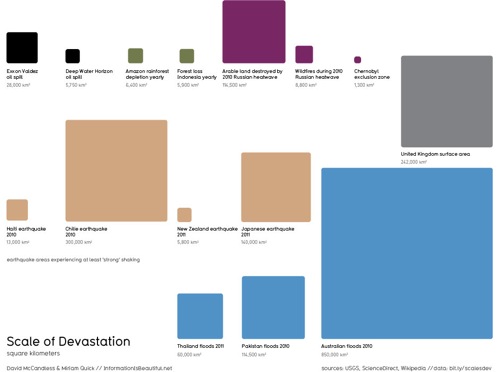
Thanks to reader D for passing along this infographic showing the scale of Thailand’s ongoing flooding.
The graphic was created by David McCandless, of the well known data visualization site Information is Beautiful.

For a bigger image — and to see how Thailand’s flooding compares to other disasters, click through to the The Guardian’s DataBlog. The post begins:
Floods. Amazon deforestation. Earthquake destruction. Satellite maps somehow don’t always help us to fully imagine the size of these disasters. Is there a better way to visualize the scale of destruction?
Here I’ve been playing with the ranges of various natural and unnatural disasters, pulling data from various media reports and the US Geological Survey.